
DESIGN OPTION 1
The first step in my design process is to research the brand I am designing for. Therefore, after I received the brief for the Tiger’s Milk “We Love Beer” campaign I read through their website and browsed their facebook and instagram pages to gain a clear understanding of their advertising and brand style.
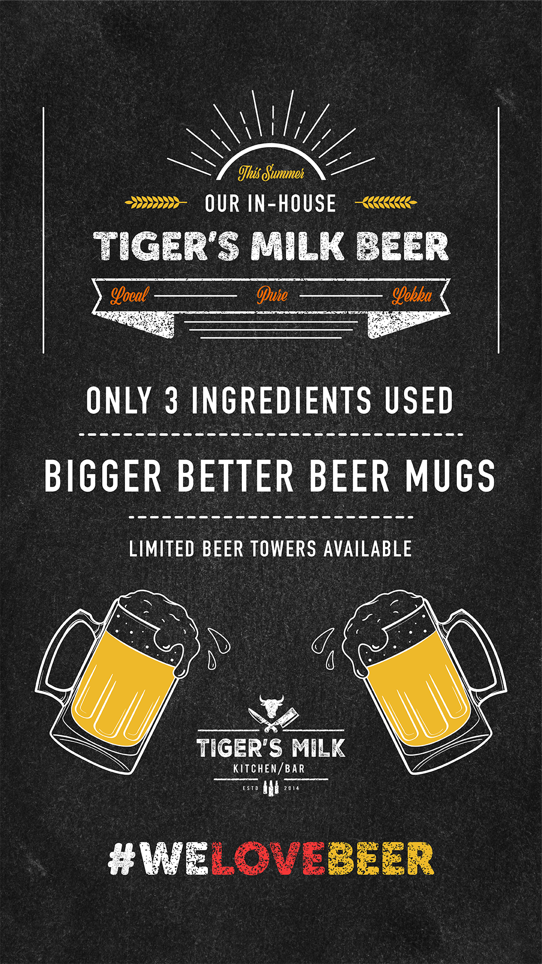
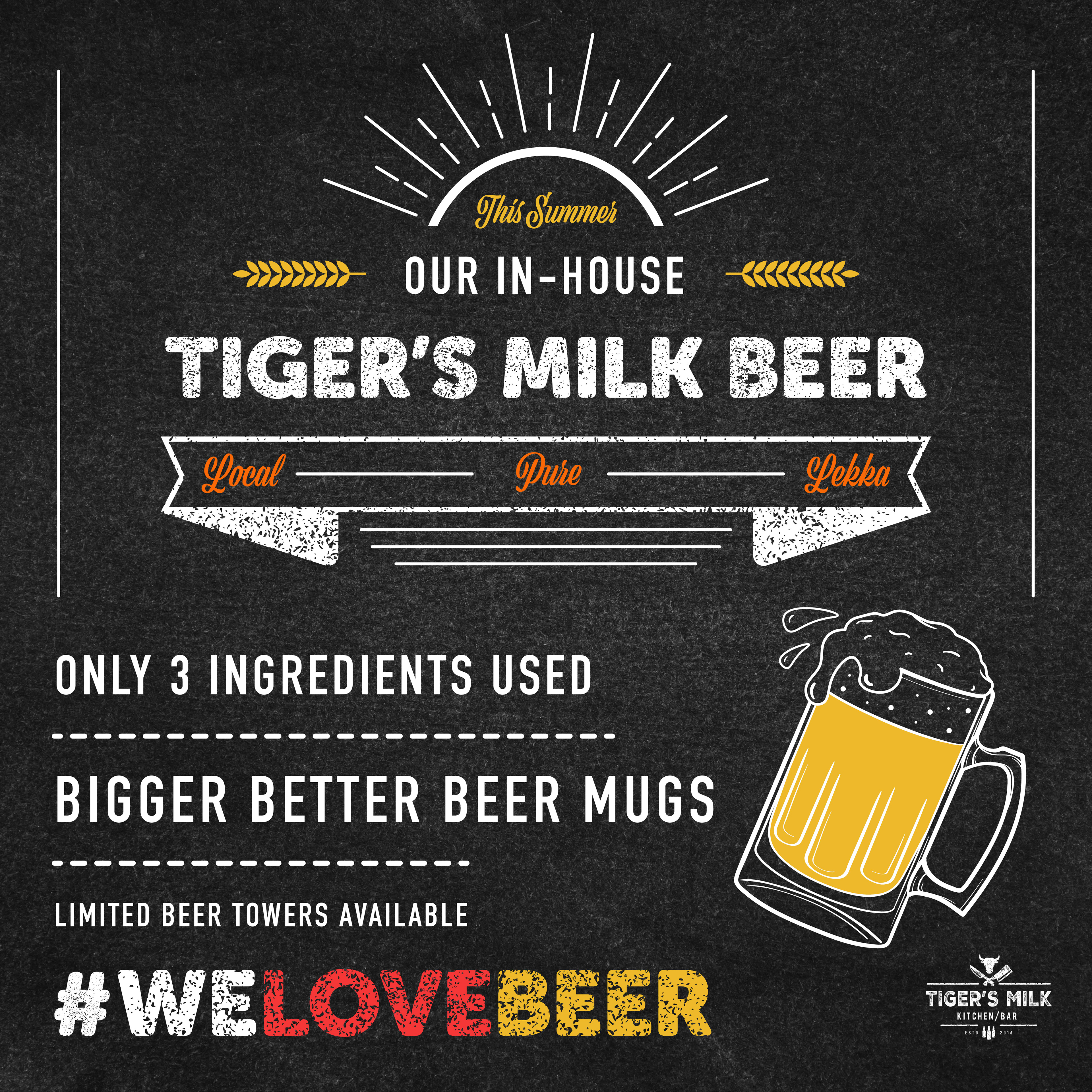
Using my Wacom tablet I designed a beer mug in illustrator to highlight the mission of the advert which is to drive more sales to their in-house beer brand. Once the beer mug graphic was complete I then attempted to find the font file that Tiger’s Milk uses on most of their social media adverts so that I could create a design that was coherent with the brand’s image and theme. However, I could not find the exact font and decided that I would re-create it myself using illustrator. I found a similar sans serif font by the name of “Museo Sans Rounded” and applied a grit/grunge/rust compound path to create the same feel grit feel of their original font. Once I was satisfied with the font result I began designing the typographic layout using a similar “sub-font” as seen in the brand’s previous social media graphics. I included wheat graphics to emphasise the beer theme and created a banner to emphasize that the beer was local and pure. After the typographic layout was complete I used a “blackboard” background as seen in the brand’s previous adverts to add texture. Finally I completed the design after adding color to grab the attention of the reader and decided to use warm colors to express the summer season.


DESIGN OPTION 2
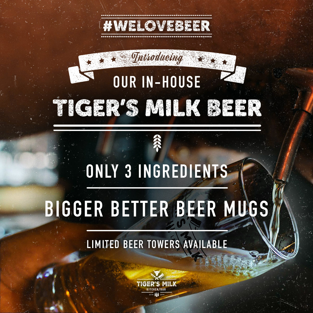
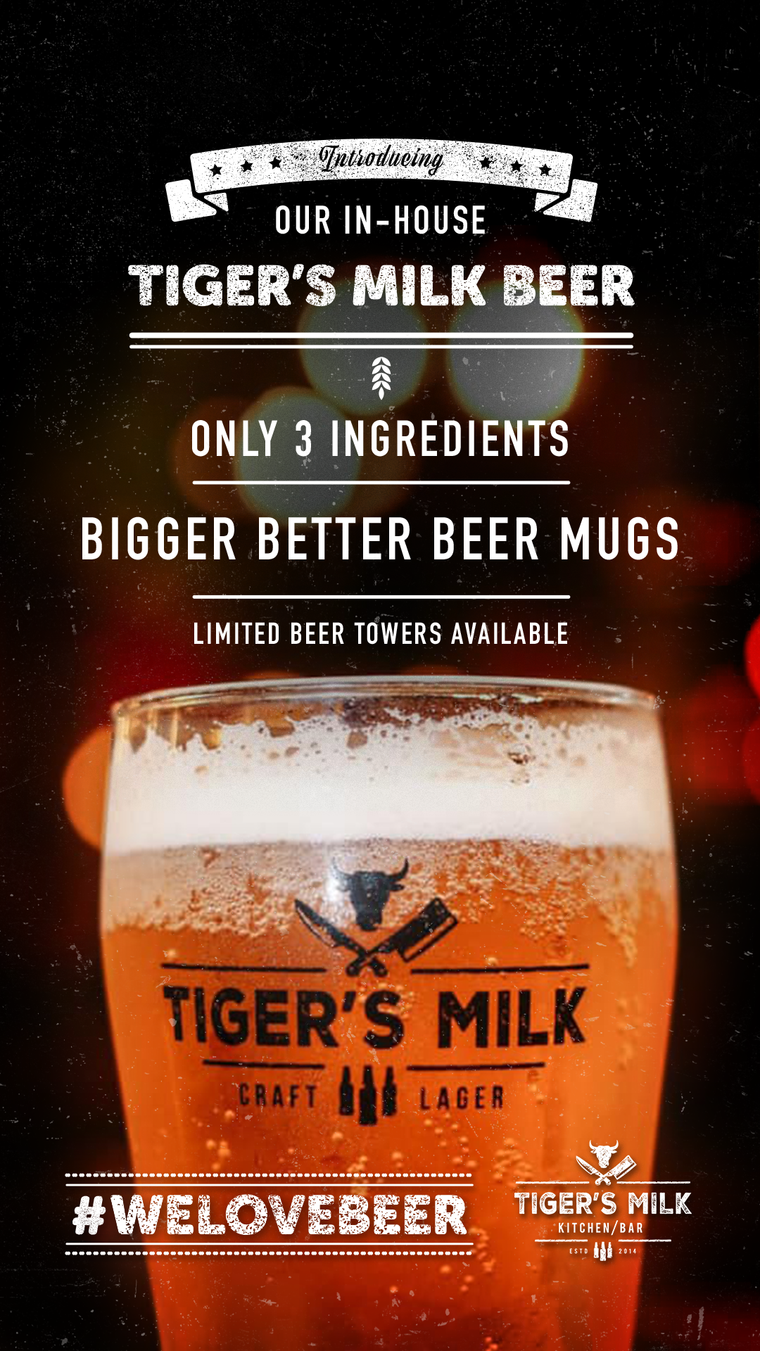
For this design I decided to source all images I could find of the advertised product of the campaign as I wanted to showcase the product on the social media graphic. I decided to emphasise the purity of the beer and the new bigger beer mugs by listing such on the advert and varying the size of each. Additionally I included a wheat graphic and “introducing” banner to tie the design together. I then made slight changes to the typographic layout to create variation from the first design option. After my typographic layout design was complete I then chose a suitable image that would interact with the typography effeciently and engage the desired target audience. I edited each image to highlight the beer and applied a grit overlay to add texture.